Heads up! To view this whole video, sign in with your Courses account or enroll in your free 7-day trial. Sign In Enroll
Well done!
You have completed Practice Data Visualization!
Preview
Welcome back. Hopefully, you enjoyed creating sketches to help determine the story we’ll be communicating to our users. Let’s take a look at my solutions.
Completed Sketches
Vocabulary
- Choropleth map: a map created by coloring in existing geographic regions based on the relative frequency of a variable.
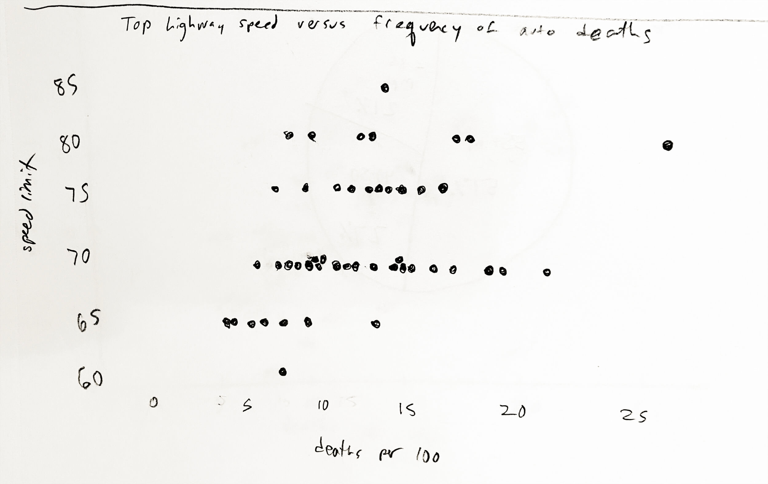
- Scatter plot: a chart that displays the values of two different variables as points so we can study the correlation between the variables.
- Outliers: data points that don’t fit the general pattern.
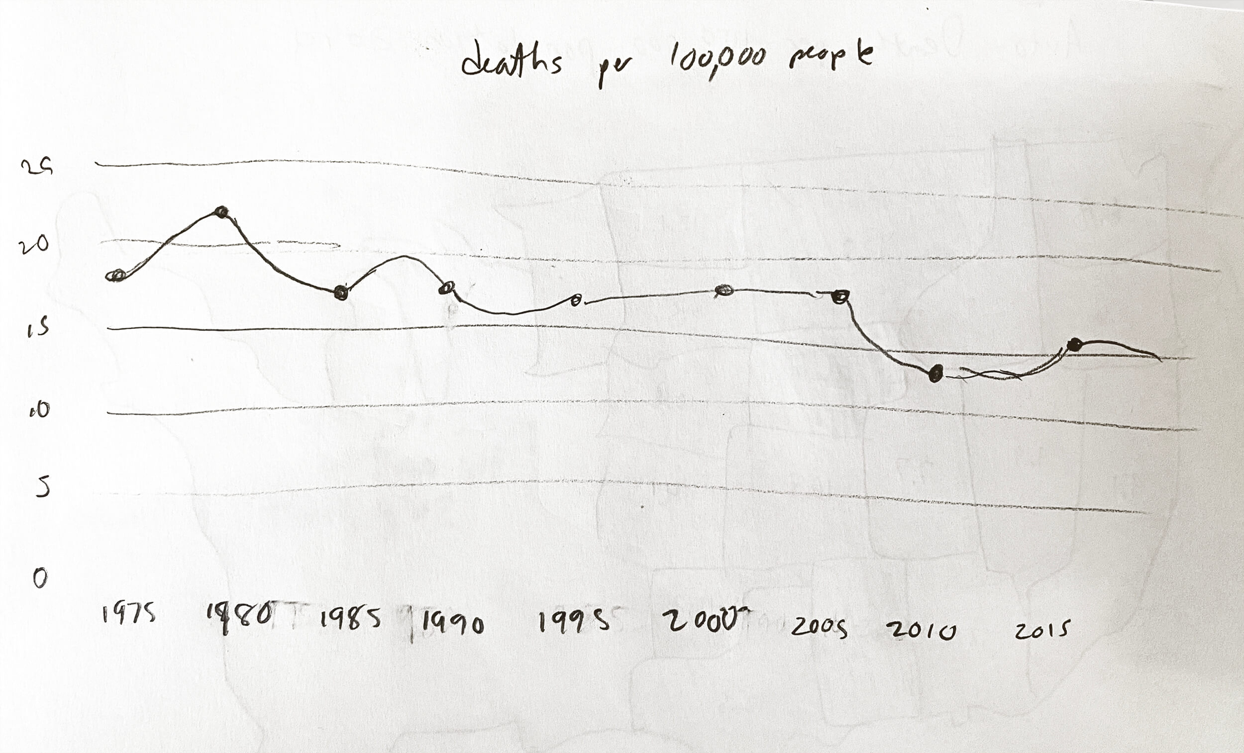
- Line chart: a chart that shows the change of data over a continuous time span. Line charts show trends or changes in value.
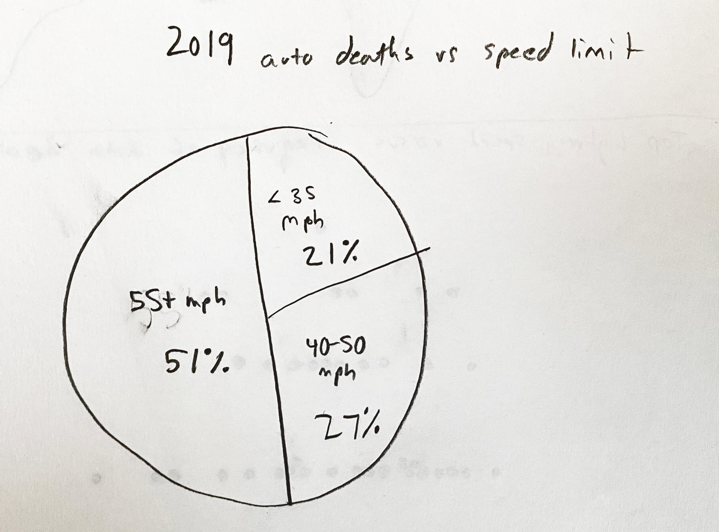
- Pie chart: A circular graph showing how a total amount is divided into parts. The size of each slice indicates a proportion of the whole.
Resources
Related Discussions
Have questions about this video? Start a discussion with the community and Treehouse staff.
Sign upRelated Discussions
Have questions about this video? Start a discussion with the community and Treehouse staff.
Sign up
Welcome back.
0:00
Hopefully you enjoyed creating sketches
to help determine the story we'll be
0:01
communicating to our users.
0:06
Let's take a look at my solutions.
0:07
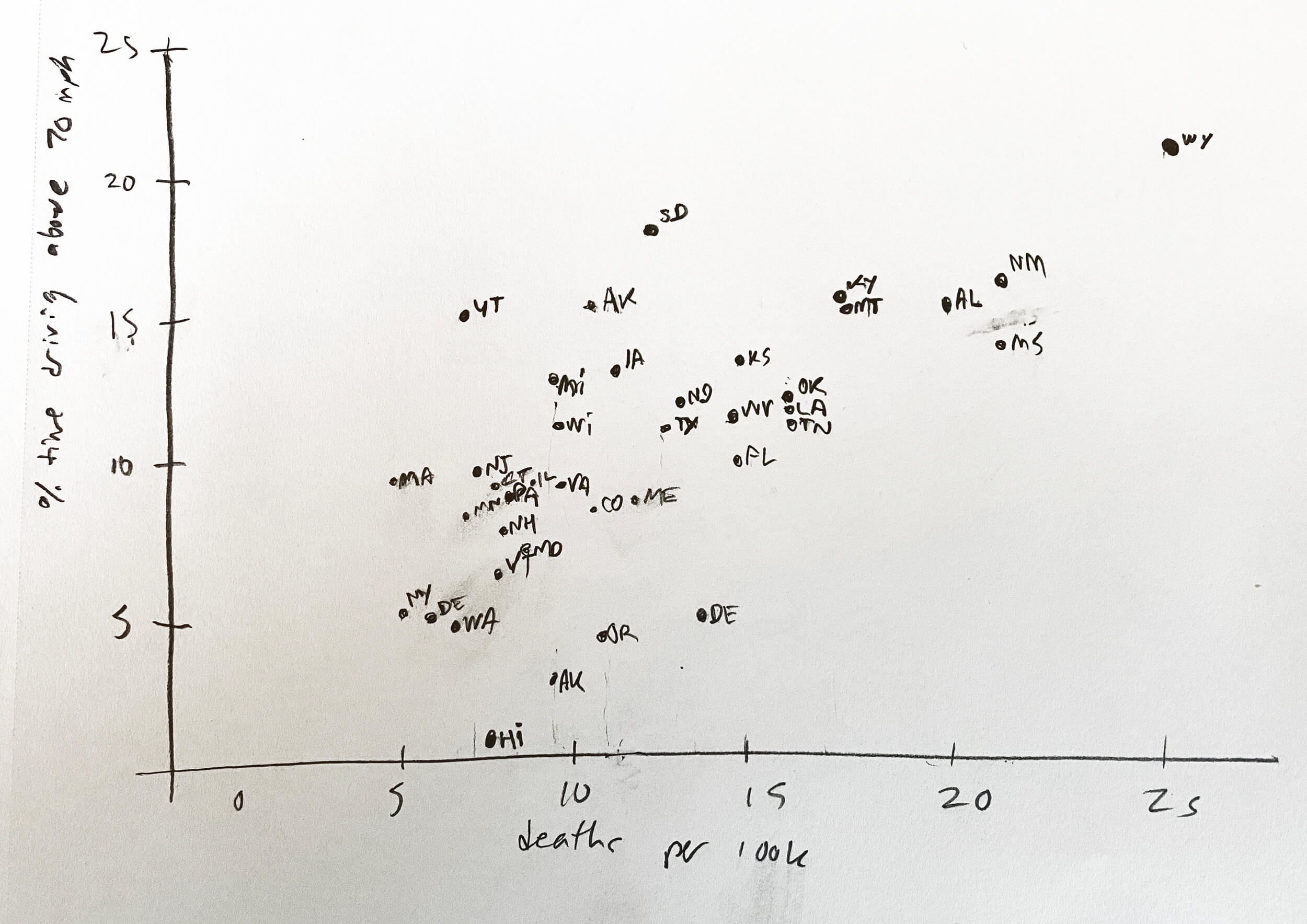
In my first sketch, I drew a choropleth
map in which darker values
0:11
represent higher rates of
death per 100,000 population.
0:15
I wanted to sketch quickly, so I drew only
the western half of the United States.
0:20
In this map, a state like New Mexico
with 20.2 deaths per 100,000
0:25
people would be much darker in color
than a state like Utah with only 7.7.
0:31
Note that choropleth maps are meaningful
only when working with relative data.
0:37
While Texas, California, and Florida
had the most auto fatalities in 2019,
0:42
these are also the three most populous
states, so there are a lot more drivers.
0:48
For my second sketch, I was curious
whether there was a correlation between
0:54
the top highway speed in each state versus
the rates of death per 100,000 people.
0:58
To calculate this correlation,
1:04
I used the list of maximum speed
limits from the same IIHS website.
1:07
Using these two data sources, I sketched
out a rough scatter plot to test this out.
1:12
Looking over my sketch, what words would
you use to describe the correlation?
1:18
I would say it's positive,
linear, and quite weak.
1:25
Even though Hawaii has the slowest
highway speeds in America,
1:30
there are quite a few states with
lower auto fatality rates for 2019.
1:34
And look at the states with maximum
70 miles per hour speed limits.
1:39
The death rate varies from 6.5 in
Minnesota to 21.6 in Mississippi.
1:44
So this particular chart contains too
many outliers to convincingly demonstrate
1:50
a correlation between top highway
speed and 2019's auto fatality rate.
1:57
Although it's possible examining trends
over time might tell a different story.
2:03
For my third sketch,
2:09
I wondered whether auto travel was
getting safer in America in general.
2:10
We can't tell by looking at
2019 statistics, but IIHS
2:15
provides a page called yearly snapshots
with annual statistics since 1975.
2:20
I've drawn this out as a line chart,
2:27
focusing only on deaths
per 100,000 people.
2:30
And it looks like driving was
considerably more dangerous in
2:33
America in the late 1970s
and early 1980s,
2:38
with another steep decline
between 2005 and 2010.
2:42
This yearly snapshot also gives
us an indication of the role
2:47
driver speed plays in fatal accidents.
2:51
I've drawn this is a pie chart, and
2:55
we can quickly see that over half
the road deaths in America in 2019
2:57
involved cars traveling 55
miles per hour or faster.
3:03
While it makes sense that faster speeds
would lead to worse accidents, I'm not
3:07
sure this chart is sufficiently meaningful
for either of my personas to share.
3:12
After doing a bit more research,
I gave another scatterplot a try.
3:17
This time comparing the amount of time
spent driving 70 miles per hour or
3:22
greater in each state versus
the fatality rate per 100,000 people.
3:27
This time the correlation is stronger
than in my previous sketch, and
3:33
I'm inclined to believe the data I'm
using is more meaningful since it
3:37
measures actual time spent driving fast.
3:41
Wyoming catches my eye here since
it's the state with both the fastest
3:44
drivers and the highest
auto fatality rate.
3:49
However, I may have the opposite
problem from my previous sketch.
3:52
While my pie chart was probably
too broad to interest my personas,
3:56
this one might be too complex.
4:01
So then I wondered, is it possible to
combine the choropleth map of auto
4:03
fatality rates with average driver speeds?
4:08
Our previous data set listing the amount
of time spent driving 70 miles per hour or
4:11
faster seemed difficult
to visualize on a map.
4:17
So I tried instead working with a
2016 set of average top speeds.
4:21
While these numbers should be easy for
American drivers to read—
4:27
78 miles per hour on Texas roads,
62 miles per hour in Oregon—
4:32
once I sketched it out, the correlation
between average driver's speeds and
4:37
the 2019 auto fatality
rate looked somewhat weak.
4:43
In the end, I decided based on the data
available to return to my first sketch.
4:47
Limiting my data to the death
rate per 100,000 people
4:53
told the most straightforward
story and the map of America
4:57
should be recognizable to
drivers in my audience.
5:02
I also feel good about
IIHS as a data source.
5:05
The 2016 list of average top highway
speeds is both an older data set and
5:09
not a firsthand source, so
I feel less confident about using it.
5:15
All right, now I'm ready to
build my choropleth map, but
5:21
what tool should I
use to begin my design?
5:25
In the next video,
we'll take a brief look
5:28
at different tools available
to create our visualization.
5:31
You need to sign up for Treehouse in order to download course files.
Sign upYou need to sign up for Treehouse in order to set up Workspace
Sign up