Heads up! To view this whole video, sign in with your Courses account or enroll in your free 7-day trial. Sign In Enroll
Well done!
You have completed Practice Sketching!
Preview
Here's one solution for creating eight rough sketches for the primary screen of a sketching application.
Related Discussions
Have questions about this video? Start a discussion with the community and Treehouse staff.
Sign upRelated Discussions
Have questions about this video? Start a discussion with the community and Treehouse staff.
Sign up
Welcome back.
0:00
Hopefully you have eight
unique ideas in front of you.
0:01
If not, no worries.
0:04
I'll take you through my solution now.
0:06
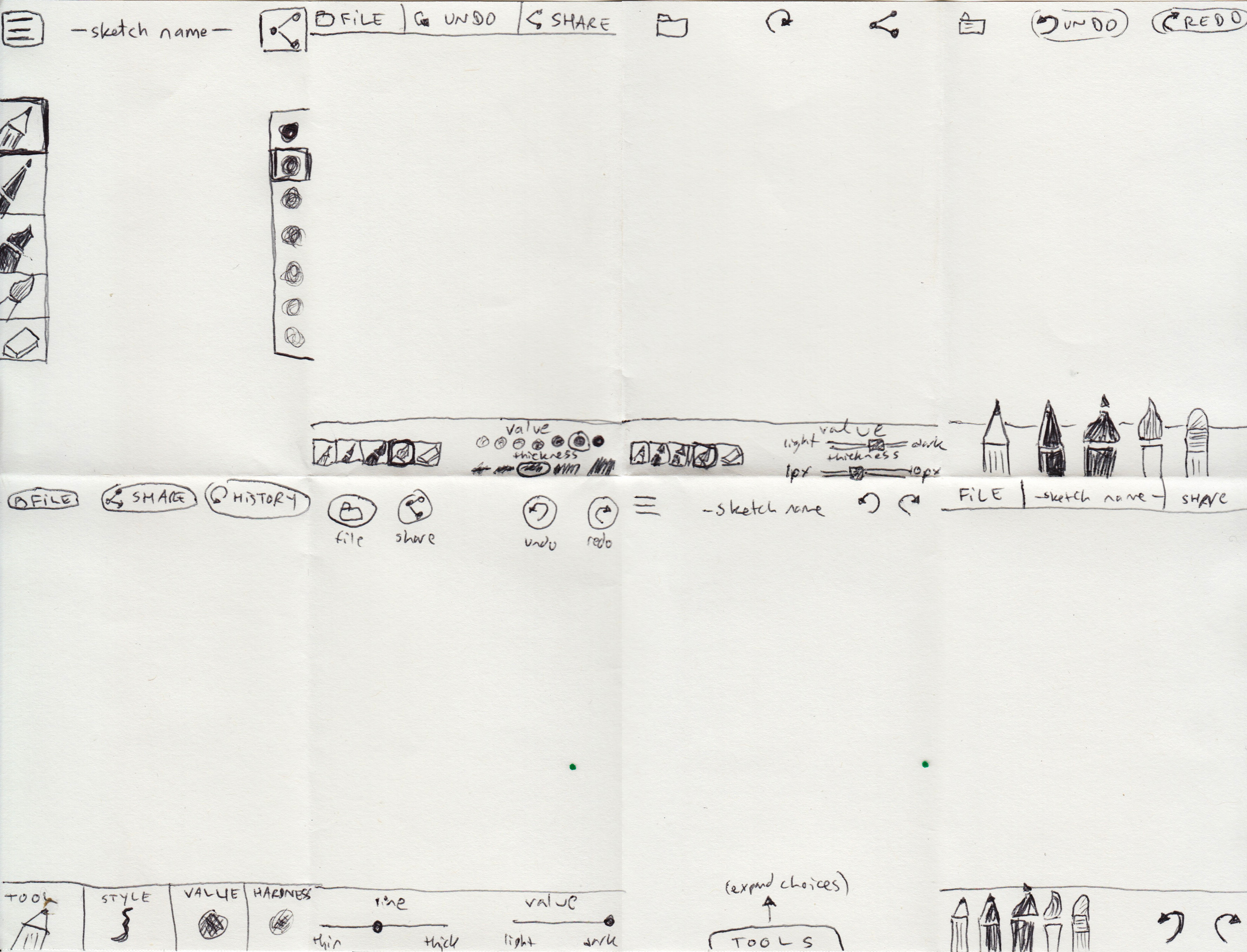
Here is my completed sketch.
0:09
In my first sketch,
I use the hamburger icon
0:12
to indicate the File menu,
though I'm a bit wary of that solution.
0:15
I'm not sure users will
know what to expect there.
0:21
I placed the drawing tools like a pencil,
pen, marker, brush and
0:25
eraser on the left,
plus a value picker on the right.
0:31
The Share button is in
the upper right corner.
0:38
I realized after the first sketch
I'd probably rather keep
0:43
important functionality at
the bottom near the user's thumb and
0:47
only make them reach up for less frequent
items like the File menu or Share.
0:52
I have drawing tools and
options for value and
1:00
thickness at the bottom of my second
sketch with File and Share up top.
1:04
I also realized I forgot in my
first sketch to allow the user to
1:11
Undo their last step.
1:16
So I've added that option
at the top center.
1:18
The value and thickness options
are likely too small and
1:22
too close together in my second sketch.
1:26
So my third sketch is
a variation of my second,
1:30
replacing the tappable boxes with sliders.
1:35
In the fourth sketch, I made
the drawing tools really prominent.
1:39
I've limited the user's
options in this one.
1:45
You can choose different tools for thick
and thin lines, but not change the value.
1:48
I did add a separate button for
Redo here to accompany Undo,
1:55
and it looks like I forgot
to provide a Share button.
2:00
The fifth sketch allows room for
much more powerful tools.
2:05
You could tap an item like style or
hardness, and
2:11
make a choice from the expanded menu.
2:15
The trade off to this approach is the user
can't switch quite as quickly between
2:18
tools.
2:23
I also called my undo/redo feature here
History, sort of like an Adobe product.
2:25
In the sixth sketch, I thought, hmm. What
if the user didn't need to switch tools?
2:33
Just let them use a pencil
the entire time and
2:40
give them options to make
the line thicker or thinner
2:43
and the mark darker or lighter.
2:47
It looks like I never figured
out where to put the eraser.
2:50
In the seventh sketch, I let the
canvas dominate the screen and
2:55
kept the tools hidden until
the user requests them.
3:00
For sketching on a small screen like
a phone, this is an interesting thought.
3:06
Though if the user wants to
switch tool settings frequently
3:11
the extra taps could cause frustration.
3:14
In my eighth and final sketch,
I made a variant of the fourth sketch
3:18
in which the Undo and Redo buttons
are closer to the user's thumb.
3:24
Now that I've completed eight sketches
in eight minutes, I can pick and
3:30
choose the best features, and continue
revising my ideas in further sketches.
3:35
I'm not too sure about sketch six,
3:42
since Artist Anastasia might not have
enough options for refining her drawing.
3:45
The collapsed tools menu in
sketch seven is intriguing.
3:52
But to pursue it, I would need to
make a drawing of the expanded menu.
3:56
Or perhaps I like a combination of
the tappable features in sketch five
4:02
with the easy to reach undo and
redo buttons in sketch eight.
4:07
What would that idea look like?
4:13
I hope you enjoyed our practice session.
4:16
Keep sketching!
4:19
You need to sign up for Treehouse in order to download course files.
Sign upYou need to sign up for Treehouse in order to set up Workspace
Sign up