Welcome to the Treehouse Community
Want to collaborate on code errors? Have bugs you need feedback on? Looking for an extra set of eyes on your latest project? Get support with fellow developers, designers, and programmers of all backgrounds and skill levels here with the Treehouse Community! While you're at it, check out some resources Treehouse students have shared here.
Looking to learn something new?
Treehouse offers a seven day free trial for new students. Get access to thousands of hours of content and join thousands of Treehouse students and alumni in the community today.
Start your free trial
Graham Davidson
Courses Plus Student 14,966 PointsLogo Feedback
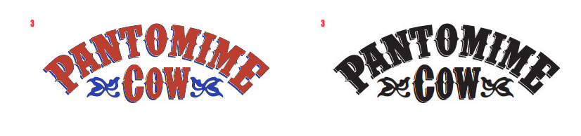
Hi all - I know there are other sites around for this kind of deal but I like treehouse so thought I would post this here. Utilising the lovely skills acquired from here I am working on setting up a new side venture at work. Essentially we are a print studio so I am setting up a digital side. These are some logo ideas at the moment. Do people have a favourite. http://www.pantomimecow.co.uk
21 Answers
Tom Bedford
15,645 PointsHi Graham
I find the "C" in "COW" very large compared to the "OW" in "COW" (smallcaps font with capital "C" at the moment?). I wonder how the letters would look if they were all the same size.
I agree with 1/7 for readability in the black/white.I feel the same colour for the center of the letter and outer border hurt the clarity with the other options.
If adding colour I think it would be interesting to play around with the borders on 2/8, 3/9 and 4/10 as this helps to define the letters without having to give up the more decorative fonts.
Using the pallet you linked to as a quick example:
You could also try them with thicker borders to help with the distinction.
Dominic Fuchs
385 PointsI like 1 and 7. They look more "clean" to me. :-)
Graham Davidson
Courses Plus Student 14,966 PointsHi Dominic yes I agree with you on that one - thanks.
G
Axel Will
4,022 PointsIt would be cool if either a Part of the cow or something from pantomime Shows within the logo. It should be readable from a distance.
Callum King
6,470 PointsYeah I agree with Dominic, 1 and 7 are my favorites, they are more readable and pleasing to the eye in my opinion.
Graham Davidson
Courses Plus Student 14,966 PointsThanks both - do you like them on the white or black background
Callum King
6,470 PointsNumber 1 is certainly my favorite on the white background.
Simon Sørensen
17,304 PointsI like 1, 7, 8. Nice ones
Graham Davidson
Courses Plus Student 14,966 PointsHI Simon thanks for that - munch appreciated
Scott Evans
4,236 PointsI would have to contradict and say Numbers 2 & 8. They aren't as "clean" as 1 & 7 but i feel they have more definition while also keeping a high level of distinction. 1 & 7 strike me as too plain for a logo.
Holger Liesegang
50,595 PointsHi Graham,
1 + 7
... and 7 with white on black looks IMHO kinda even "more interesting" :)
2 + 8 would be fine in a world where all Tablet's/PC's are equipped with HD (Retina) Displays :)
Graham Davidson
Courses Plus Student 14,966 PointsThanks Scott and Holger - we are also toying with bringing a small amount of colour into the logo as well.
Graham Davidson
Courses Plus Student 14,966 PointsThanks Scott and Holger - we are also toying with bringing a small amount of colour into the logo as well.
Scott Evans
4,236 PointsWhat sort of business is it, maybe we can throw some colour scheme ideas out there.
Graham Davidson
Courses Plus Student 14,966 PointsHi Scott - its a digital studio - Good at the Back End and Good At The Front End - aka Pantomime Cow
Graham Davidson
Courses Plus Student 14,966 Pointswebsite is having this (very loose) can of feel to it http://www.arthurlloyd.co.uk/ManchesterTheatres/LondonMusicHallPoster.jpg
Scott Evans
4,236 PointsThe logo with a nice Green or Blue sort of scheme, maybe border or shadow jumps out to me.
Graham Davidson
Courses Plus Student 14,966 Pointscool thanks Scott - I might post the development of the project up here if people are interested
Scott Evans
4,236 PointsId Love to see the progress on this. I've also been looking to branch out my portfolio as well, if you are ever looking for any help give me a shout. You can contact me directly at scottevans93@gmail.com. We could throw around a few ideas.
Graham Davidson
Courses Plus Student 14,966 Pointscool you can get me on g@justg.co.uk
Graham Davidson
Courses Plus Student 14,966 PointsHi Tom
Thanks for that and thanks the injection of colour - can totally see what you mean by the large C never really noticed that before - also the E now looks a little out as you come to mention it